Hello friends, I hope you are doing well. This is the fourth tutorial in our series on how to create a Proteus library. In the previous tutorial, How to Draw a Component Symbol in Proteus with 2D Graphics, we drew our Traffic Light Module with the box, circle and text tools: a black board, three lamps in grey rings, three resistors, a title and four pin names. Along the way we set a few colours without explaining them. Today, we look at those settings in detail. Our topic is how to make a realistic component in Proteus with graphics styles and colours.
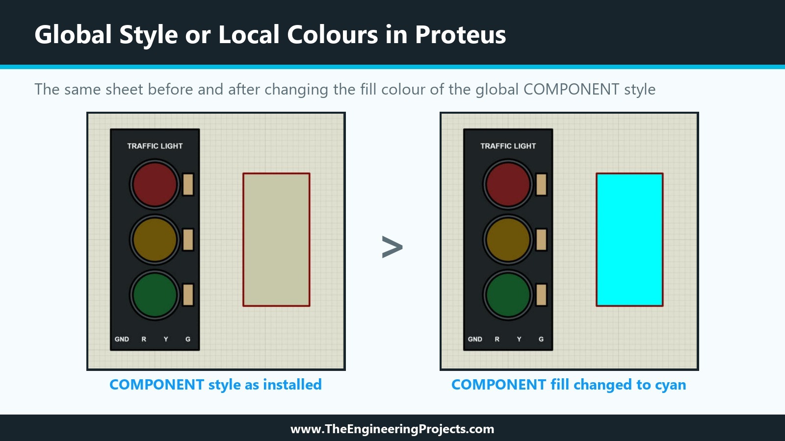
We will see what a graphics style is, how global styles differ from local colours, what the Follow Global and Lock settings do, which line and fill options Proteus offers, how to choose exact colours, and why a realistic part should carry its own colours. We also ran a small test on our own sheet: we changed the global COMPONENT style and watched which shapes changed and which did not. The result is in the picture below, and it explains the whole topic at a glance.
All dialogues and values in this tutorial come from Proteus 8.5 Professional on our PC; the test was undone afterwards, so our design still uses the styles as installed. The picture below shows the sheet before and after the test: the plain box follows the global style and turns cyan, while the Traffic Light Module keeps every colour.
What Is a Graphics Style in Proteus?
Every 2D graphic in Proteus, whether a line, a box, a circle, an arc or a path, belongs to a graphics style. A style is a named set of appearance settings: the line style, line width and line colour, and the fill style and fill colours. When you select a 2D graphics tool, the object selector lists the available styles, such as COMPONENT, PIN, PORT, MARKER, TERMINAL, WIRE, BUS WIRE and BORDER, and the style you pick there is the style of the next shape you draw.
The idea behind styles is consistency. Proteus draws the bodies of all parts in the COMPONENT style, all pins in the PIN style, all wires in the WIRE style, and so on. If you want every component body in a design to have a thinner outline, you change the COMPONENT style once, and every part that follows it changes with it. For ordinary box symbols this is exactly what you want.
Global Styles: Template, Set Graphic Styles
The global styles of a design are edited from the Template menu of the schematic editor. In Proteus 8.5, the Template menu offers Goto Master Sheet, Set Design Colours, Set Graph and Trace Colours, Set Graphic Styles, Set Text Styles, Set 2D Graphics Defaults, Set Junction Dot Style, Apply Styles From Template and Save Design as Template. Set Graphic Styles opens the Edit Global Graphics Styles dialogue.
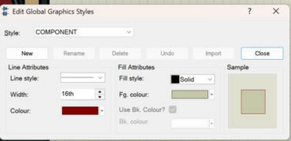
At the top, the Style list selects the style to edit, and the buttons New, Rename, Delete, Undo, Import and Close manage the styles themselves. Below them, the settings are split into line attributes and fill attributes, with a sample on the right. As installed in Proteus 8.5, the COMPONENT style has a solid line 16 thou wide in a dark red (red 128, green 0, blue 0) and a solid fill in a light greenish beige (200, 200, 170). That is why every box or circle you draw in the COMPONENT style looks dark red and beige until you change it.
Line Attributes
- Line style: none, a solid line, or one of several dashed and dotted patterns. "None" hides the outline completely, which is useful for shapes that should be pure areas of colour.
- Width: the line width, 16th for COMPONENT. Typed values take units like any other field.
- Colour: the line colour, also used for the outline of filled shapes.
Fill Attributes
- Fill style: None, Solid, Horz., Vert., Back Diag., Fwd Diag., Cross and Trellis. None leaves the shape transparent, Solid fills it with one colour, and the others are hatch patterns.
- Fg. colour: the fill colour, or the colour of the hatch lines.
- Use Bk. Colour and Bk. colour: a background colour, which the help describes as available for particular graphic types only. With a solid fill, the option is greyed out.
Local Colours: The Edit Style Tab of a Shape
A global style changes everything that follows it. A realistic part needs the opposite: a black board must stay black and a red lamp must stay red, whatever the style of the design. For this, each shape has its own copy of the settings on the Edit Style tab of its Edit Properties dialogue. The help calls these local, fixed values.
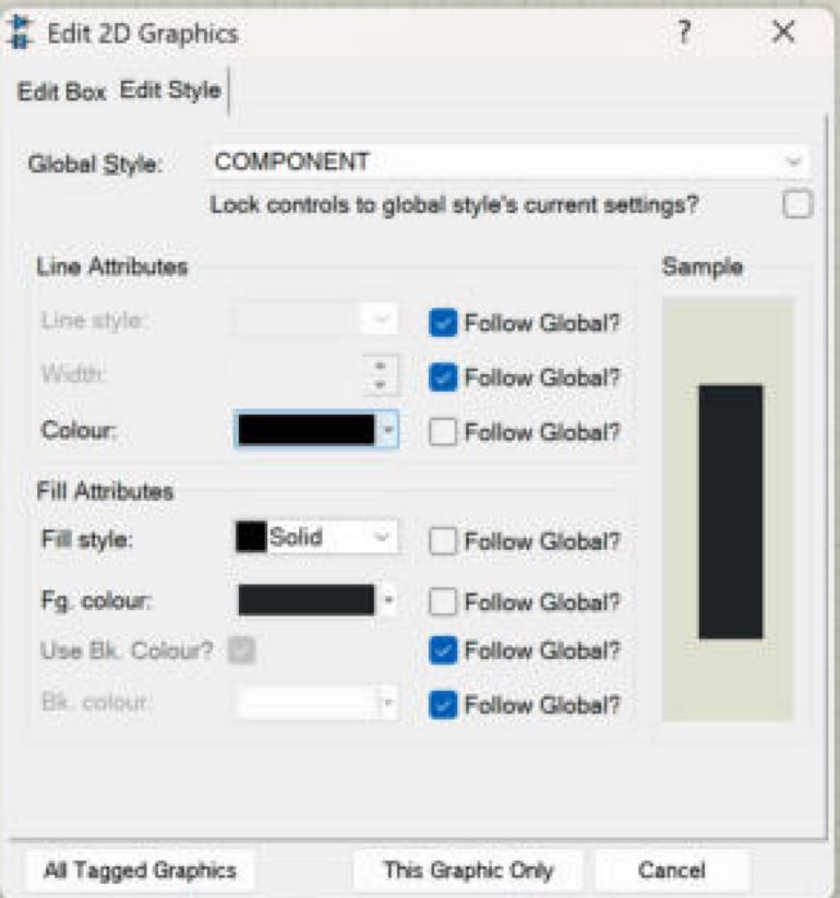
The tab shows the global style the shape is based on (COMPONENT for all our shapes) and the same line and fill settings as the global dialogue, each with a Follow Global? box:
Follow Global and Lock Controls
- A ticked Follow Global box means the setting comes from the global style; the control next to it is greyed out.
- An unticked box means the shape uses its own value, which you can now choose.
- Lock controls to global style's current settings? at the top disables controls whose settings make no sense with the current global style. For our shapes, we unticked it first and then the Follow Global boxes we wanted to change.
For the board shown in the screenshot, we unticked Follow Global for the line colour, the fill style and the fill colour, and chose black for the line and a solid near-black fill. The line style and width still follow the global style. This mix is deliberate: the colours are part of the look of the real board and must never change, while the line width can stay consistent with the rest of the design.
Local Colours for Text
Text has its own dialogue, but the same idea: the Edit 2D Graphics Text dialogue has a Graphic's Style section with a colour and a Follow Global box. For our white labels, we unticked Follow Global and chose white.
How to Choose an Exact Colour in Proteus
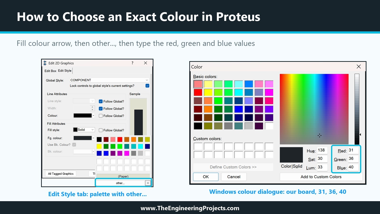
Clicking the small arrow of a colour control opens a palette with a few rows of standard colours, a (Paper) entry and a button called other.... The palette is quick, but its colours are strong primary shades. The other... button opens the standard Windows colour dialogue, in which you can type exact values for red, green and blue (or hue, saturation and luminance). We set every colour of our module there, so the numbers are exact and repeatable.
The Palette and the Windows Colour Dialogue
The picture below shows both steps on our board: the palette that opens from the arrow of the fill colour, with other... at the bottom, and the Windows colour dialogue showing the board's values, red 31, green 36 and blue 40. The dialogue also shows the same colour as hue, saturation and luminance; either set of numbers can be typed.
The Colour Plan of Our Module
Here is the complete colour plan of the Traffic Light Module, including the bright colours we will use for the lamps when we animate them later in the series.
TRAFFIC LIGHT MODULE - COLOUR PLAN (local values, red / green / blue)
Every graphic: global style COMPONENT, line style and width follow the global style (16th).

Element            Fill style  Fill colour       Line colour   Notes
Board              Solid       31, 36, 40        0, 0, 0       near-black PCB
Lamp rings         Solid       70, 76, 82        0, 0, 0       grey bezel around each lamp
Red lamp, off      Solid       110, 30, 30       0, 0, 0       dark: the lamp is off
Yellow lamp, off   Solid       110, 85, 10       0, 0, 0
Green lamp, off    Solid       20, 85, 40        0, 0, 0
Resistors          Solid       196, 166, 120     0, 0, 0       beige body
Title, pin names   text        255, 255, 255     -             bold, like silkscreen

Planned "on" colours for the animation tutorial:
Red lamp, on       Solid       230, 57, 53
Yellow lamp, on    Solid       255, 179, 0
Green lamp, on     Solid       46, 196, 98

COMPONENT style as installed in Proteus 8.5 (Template > Set Graphic Styles):
line solid, width 16th, colour 128, 0, 0; fill Solid, colour 200, 200, 170.
Step by Step: How We Coloured the Red Lamp
To make the settings concrete, here is exactly what we did for the red lamp of our module. The same steps apply to every other shape; only the colour values change.
- In selection mode, right-click the outline of the lamp circle and choose Edit Properties. The Edit 2D Graphics dialogue opens on the Edit Circle tab.
- Click the Edit Style tab. Global Style shows COMPONENT, and all Follow Global boxes are ticked, so the lamp is still dark red and beige.
- Untick Lock controls to global style's current settings?.
- Untick Follow Global? next to the line colour, the fill style and the fill colour. The three controls become active and show the current values of the style.
- Make sure the fill style is Solid.
- Click the arrow of the fill colour, then other..., and type red 110, green 30, blue 30 in the Windows colour dialogue. Click OK.
- Click the arrow of the line colour and pick black from the palette.
- Check the Sample on the right, then click This Graphic Only.
The lamp now shows a dark, slightly brownish red: clearly a red lamp, clearly switched off. When we made the yellow and green lamps with Block Copy, the copies kept these local settings, so for them only step 6 had to be repeated with their own values. This is one more reason to set the local style on the first shape before you copy it.
How We Chose the Off Colours
How were the values chosen? We started from the bright colours of a lit lamp and darkened them to roughly half their brightness, keeping the hue. A lamp that is off on a real board is not black; it shows its tinted lens. Our dark red, dark amber and dark green do the same, so a viewer recognises all three lamps even when none of them is lit. The bezel colour of the rings sits between the board and the lamps in brightness, which gives the lamps a little depth without adding detail.
Our Test: What Happens When the Global Style Changes?
To see the difference between global and local settings with our own eyes, we placed a plain box next to the module. The box was drawn in the COMPONENT style and left as it was, so it follows the global style completely. Then we opened Template, Set Graphic Styles, selected COMPONENT and changed the fill colour to cyan from the palette.
The picture at the top of this tutorial shows the result. The plain box turned cyan at once. Its outline stayed dark red, because we had changed only the fill colour of the style. The Traffic Light Module did not change at all: its board, rings, lamps and resistors all have local colours, so the global style no longer affects them.
Afterwards, we set the fill colour of COMPONENT back to its original value (200, 200, 170) through the other... button, deleted the test box and saved the design. If you repeat the test, write down the original values first, or use the Undo button of the dialogue before closing it.
Why a Realistic Library Part Needs Local Colours
This test matters more for a library part than for a single drawing. Graphics that follow a global style take their look from the style of the design they are used in, and that style can be different in every design. A part drawn entirely in the global COMPONENT style may therefore look different from one design to the next. A part whose important colours are local looks the same everywhere.
That does not mean every setting should be local. A good rule for realistic parts:
| Setting | Box symbol | Realistic part |
|---|---|---|
| Fill colour | Follow global | Local: it is part of the real look |
| Fill style | Follow global | Local (Solid), so the colour always shows |
| Line colour | Follow global | Local where the outline belongs to the look, for example black edges |
| Line width | Follow global | Usually global, for consistency with other parts |
| Line style | Follow global | Global, or None for borderless areas |
| Text colour | Follow global | Local when the text sits on a dark board |
Pins are the exception: they should look like pins in every part, so we leave them in the PIN style when we add them in a later tutorial.
Tips for a Realistic Look
- Use a small palette. Our module uses seven colours. More colours rarely add realism; they add noise.
- Design the off state carefully. A lamp that is off should still look like a coloured lamp, only darker. Pure grey looks like a hole.
- Add depth with rings and borders. A slightly lighter ring around each lamp separates it from the board, much like the bezel on the real part.
- Keep strong contrast. People often view schematics zoomed out; white text on a dark board stays readable, mid-grey on dark grey does not.
- Prefer solid fills. Hatch patterns are a drawing convention; on a realistic part they look like texture errors.
- Leave room for animation. The "on" colours should be much brighter than the "off" colours, so the change is obvious during a simulation.
- Write the colours down. A colour plan with exact RGB values makes later edits and the animation states easy to match.
How to Check the Colours Before Making the Device
Before a drawing becomes a library part, it is worth checking its colours the way users will see them. We do three quick checks.
- Zoom out. Press F7 a few times, or F8 to view the whole sheet. At this size, the labels must still be readable and the three lamps must still be told apart. If a colour only works at full zoom, it is too subtle.
- Compare with the plan. Open Edit Properties of each shape and compare the values on the Edit Style tab with the colour plan. A Follow Global box that is still ticked by mistake shows up here at once.
- Imagine the on state. Hold the planned on colours next to the off colours. The difference should be obvious even zoomed out; if it is not, darken the off colours or brighten the on colours now, before any state symbols exist.
Our module passed all three: the white labels stay readable at the whole-sheet view, the dark lamps remain clearly red, amber and green, and the planned on colours are roughly twice as bright. Fixing a colour at this stage takes seconds. After the part is made, it means decomposing it, changing the shape and making the device again.
Common Mistakes with Proteus Graphics Styles
| Problem | Cause | Solution |
|---|---|---|
| The colour controls on the Edit Style tab are greyed out | Follow Global is ticked, or the controls are locked | Untick "Lock controls..." and the Follow Global box of the setting |
| A part looks different in another design | Its graphics follow the global style of that design | Set the important colours as local values |
| All box symbols in a design changed colour | The global COMPONENT style was edited | Undo in the dialogue, or set the original values back |
| A shape shows stripes instead of a colour | A hatch fill style is selected | Choose Solid |
| A colour cannot be matched later | It was picked by eye from the palette | Use other... and note the RGB values |
In the Next Tutorial
Our Traffic Light Module now has its final colours. In the next tutorial, How to Use Make Symbol in Proteus, we will look at symbols: how to turn a group of graphics into a reusable symbol, how symbols are stored in symbol libraries, and how grouping helps when we prepare the lamps for animation.
FAQ
How do I change the colour of a component in Proteus?
Right-click the outline of the shape, choose Edit Properties and open the Edit Style tab. Untick "Lock controls..." and the Follow Global box of the colour, then pick the colour. Use other... to type exact RGB values.
What is the difference between global and local styles in Proteus?
A global style, edited under Template, Set Graphic Styles, applies to every shape that follows it. A local value is set on one shape's Edit Style tab and overrides the global style for that shape only.
What are the default colours of the COMPONENT style?
In Proteus 8.5 as installed, a solid line 16 thou wide in dark red (128, 0, 0) and a solid fill in light beige (200, 200, 170).
Which fill styles does Proteus support?
None, Solid, Horz., Vert., Back Diag., Fwd Diag., Cross and Trellis. Solid fills with one colour; the others draw hatch patterns.
How do I remove the outline of a shape in Proteus?
Set its line style to None, either in the global style or as a local value on its Edit Style tab.
Should a library part use global or local colours?
Simple box symbols should follow the global styles. Realistic parts should set their important colours locally, so they look the same in every design; line widths and pins can stay global.
That is all for today. Our module now looks like the real board in every design. If you have any questions, ask in the comments. Take care.